Delete vs. City Wipeout
November 6th, 2006 by Fabio
Eigentlich sind die Konzepte der 2 Projekte ziemlich aehnlich. Visuell ist jedoch eins das Gegenteil des anderen. Sehr interessant:
vs.
Ueber Kolhonens Wipeout:
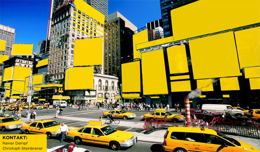
It seems that today’s cities are filled up with images. Spaces without some form of advertisements are becoming scarce. The city-dweller’s field of vision is dominated by commerce.The signage in cities provides an international language for navigation and is part of Western consumer culture, in New York and Tokyo as well as in Helsinki.
Architect and researcher Pasi Kolhonen wants to reveal with his City Wipeout installation just how many images, texts and signs we find in our everyday environment. The installation consists of pictures which unveil an ordinary face of the city centre. The pictures are reflected one-by-one on the wall. The user interface allows the spectators to wipe the view clean of everything but the advertisements, signs or logos. All that remains is the blanket of advertising that covers the entire city. That blanket is not always noticed although it is constantly present in our daily life.
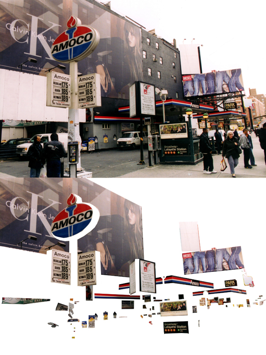
Ähnlich geht auch Matt Siber vor. In seiner Arbeit “The Untitelt Project” löst er alle Schriftzeichen aus Fotos und stellt diese dem “gereinigten” Foto gegenüber.
Auch in seinen anderen Projekten, wie z.B. den “Floating Logos” verarbeitet er die Welt der (Marken)zeichen im öffentlichen Raum.
Weitere Projekte der Art:
http://sum1.onreact.com/index.php?p=772
http://sum1.onreact.com/index.php?p=655
http://sum1.onreact.com/index.php?p=643
[…] Konzept her nicht ganz neu (siehe City Wipeout), aber diessmal aufs Medium Magazin appliziert, One Page Magazine ist ein Projekt von Joseph Ernst, […]